4 STEPS TO WRITE EFFECTIVE UX COPY
We've all been there – like that episode of SpongeBob trying to write his “what I learned in boating school is” essay — staring at a blank screen, wondering if our words will ever make a connection. Don’t waste another minute! Whether you’re reaching tech-savvy pros or the grandma-next-door, we’ve got your back with 4 simple steps to ensure you’re effectively getting the message across and making them shine.
1. Define the message
What are you trying to say?
2. Make it Friendly
Your messages needs to reach everybody who might encounter it—from those who use tech like it’s second nature to the sweet as can be but absolutely clueless grandma who calls her grandchildren to figure out how to close an app. Imagine the sweet as can be grandma and try to speak her language a bit.
3. Shorten it
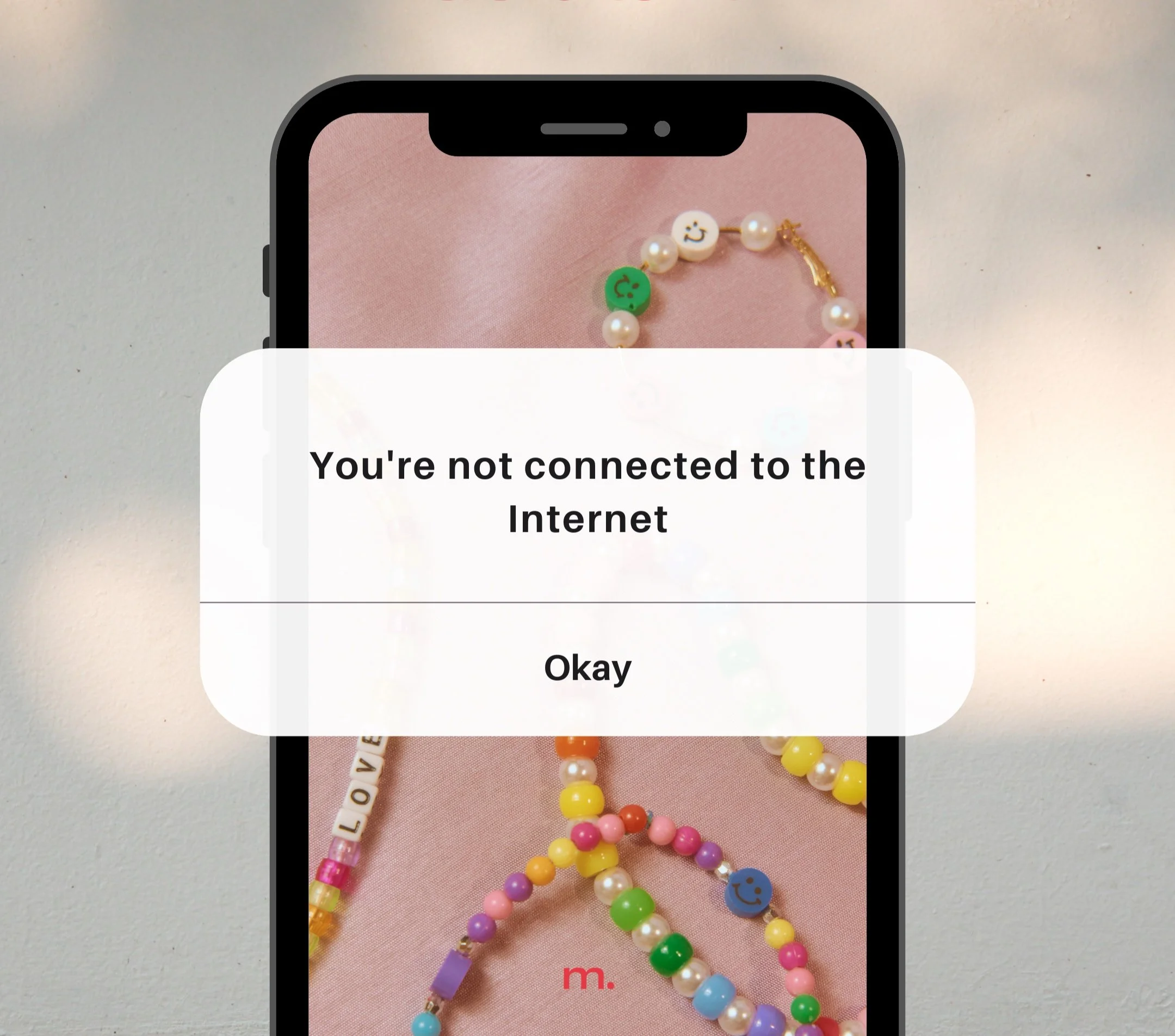
Neither the second-nature user or the sweetie grandma want to spend minutes trying to figure to what you’re saying, be clear and concise.
4. Make it Useful
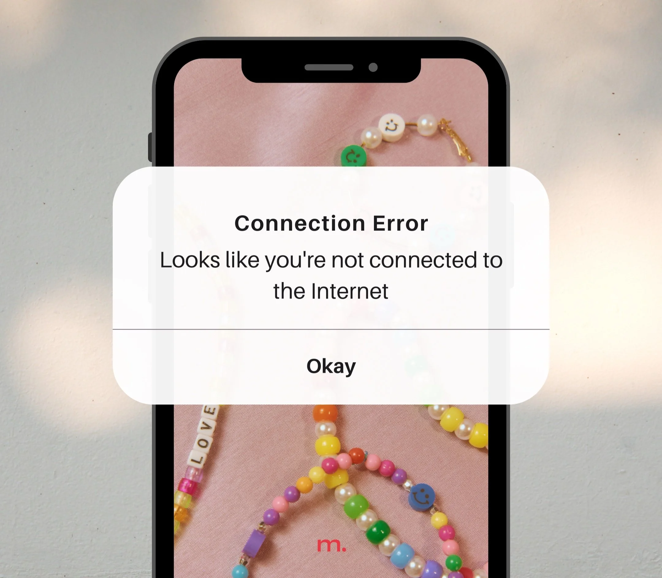
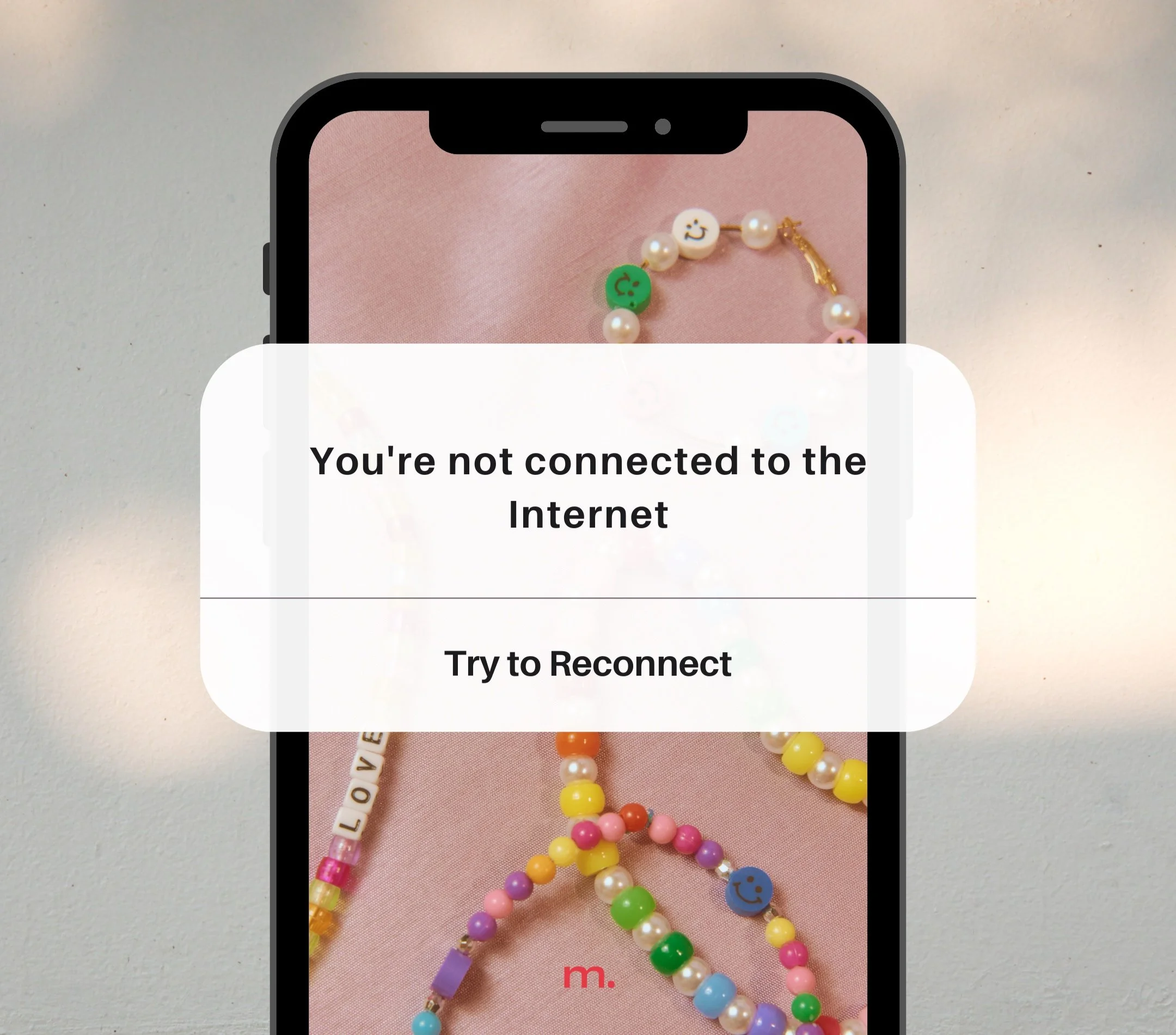
Receiving errors is never a fun situation to be in, try to make it as easy as possible by offering solutions anytime you have to deliver an error message.
Even if you’re not writing an error message, always try to offer useful solutions for the next steps you want your users to take. For example if you’re showing off portfolio work, add an actionable button for how potential clients can contact you for their upcoming project. This can have a major impact on drop-off rates!
Notes
This is a generalized, big picture kind of list. Sometimes, it might be beneficial to keep some of the fluffy, personality language instead of cutting your copy to be as concise as possible. These messages can be a helpful way to infuse your brand into the user’s experience. Here are some examples:
NPR uses “Oops! we goofed” when there’s an error with their app. This works because of their target market and it aligns with the kind of language their reporters might use, but if apple said that it would probably raise some eyebrows.
Twitter (X??) uses those weird rubber chickens when something won’t load or there’s nothing to show, this would be super off-putting if it was coming from a refined brand like microsoft or nike but it somewhat lands when twitter (x) does it because of their goals and users.


